|
Art has arguably been around almost as long as humans have. The moment we learned to mark something for others to see and interpret, the moment art was born. Thankfully for us photographers, we needn’t go quite that far back to begin learning from the history of art. In fact, we only need to go as far as the “Old Masters.” Old Master Who?To those unsure as to who the ‘Old Masters’ were: they are the painters that worked in Europe prior to the 1800s. More specifically, it refers to the ones who were working at the top of their game, and many of their pieces will still be displayed in galleries around the world to this very day. At a time before social media and marketing, these artists had to heavily rely on simple raw talent and skill to succeed. In fact, one could argue that it was only truly great artists that did succeed back then — you couldn’t simply buy your way to popularity, nor could you hire somebody to “finish” or “retouch” your work. There were no shortcuts to success back then. You actually had to put time and dedication in to succeed. What Could We Possibly Learn from Old Paintings?The reason I mention this slightly cheeky jibe at the current state of art and photography is that I wonder how many of us will have our work viewed in a hundred years? Not many, I’m guessing. So with this in mind, any artwork we hold in high regard now from one hundred or maybe even four hundred years ago deserves some serious attention. You don’t get your work displayed and admired for centuries unless you seriously knew what you were doing, and I feel we can learn a lot from looking at their work. In this article, I aim to look at the work of some Old Masters and see what made some of their paintings so successful at the time. What did they do that caught the attention of the viewer? What tricks did they use to lead the viewer’s eye? How did they tell a story in a single frame? #1. HDRNow before you all leave in disgust at the very mention of HDR, let me explain. For those unaware, HDR stands for High Dynamic Range, which in reality translates to very little pure black shadows and very little pure white highlights in your shot. In effect, you use tools like multiple exposures or multiple lights to ensure that every part of your image is evenly lit. Done poorly, your image will look flat and visually very confusing. This technique was painfully overused in the mid-2000s and now has a pretty bad reputation whenever the term is muttered in dark corners of camera clubs across the globe. So how on earth were the Old Masters using HDR back when they were arguing over whether squirrel or badger eyelashes made for better paintbrushes? Well, painters have a unique trump card and that’s their ability to paint any area of their canvas whatever brightness they want. Leonardo Di Vinci was a master at interpreting light and he would often use his ‘artistic license’ to convey the impossible in his outdoor portraits. Take a look at ‘The Virgin and Child with Saint Anne’ below. 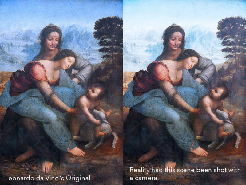
As those of us who’ve ever shot portraits outside will know, getting nicely exposed directional light on your subjects, as well as a correctly exposed background, is tough. In the left image is Leonardo da Vinci’s original painting and on the right is an interpretation of what this scene may have looked like had it been taken with a camera. Painters were masters at somehow never overexposing their backgrounds and of course that’s because they didn’t have to worry about one single exposure, they could use whatever brightness they wanted in their backgrounds. We as photographers need to bear the same things in mind because having detail in the background of an outdoor portrait is nearly always preferable to blown out highlights just like we can see in the right-hand image above. One way to get even exposure throughout your shot is to use HDR. With HDR, you take multiple shots at varying exposures and then merge them later in post. This is fine for landscapes, but for portraits, the subject will likely move between images and the multiple exposures will rarely line up. The alternative to this is to simply expose the shot for the background and then add additional lighting on the subject in the foreground to even out the exposure of the shot. In the images below (thank you to my ever-patient wife that allowed me to take these test shots to show you), you’ll see the reality of shooting outdoors.
In the top left image, we have our subject correctly exposed but the background is very overexposed. In the top right, we have the background correctly exposed to show color and detail but now our subject is very dark and underexposed. Finally, on the bottom, I added some additional lighting so that we can now get an accurate exposure on both the subject and the background, simultaneously. It’s in these instances that a little technical knowledge is required to ensure a dramatic shot compared to a very blown out background or a very dark subject. This higher dynamic range in imagery is a skill painters inherently took for granted at the time, but it’s a skill that we modern photographers must thoroughly understand if we ever hope to create evenly exposed portraits of people outdoors like they did hundreds of years ago. #2. Using Color to Separate Foreground and BackgroundIn recent years, the trend of shooting everything wide-open at f/2.8 or wider has been rampant. Don’t get me wrong, I do it too and I like the look it gives, but why? For some, the very shallow depth of field is a way of separating themselves from the iPhone generation. Before Portrait Mode, the tiny smartphone lenses couldn’t accurately create any depth of field in their images, so everything in a phone shot appeared in sharp focus. Larger lenses and sensor sizes allow for a shallower depth of field and as such, shooting everything wide-open separates your imagery from the simple ‘snapshot’. More importantly than this though, shallow depth of field is a great way to control and guide the viewer’s journey around a shot. If you want the attention to be on the subject and not the background, you make the background blurry and the viewer has no choice but to concentrate on the subject. 
In the shot above, you’ll see that I’m using a very shallow depth of field to throw the background out of focus so as to force the viewer’s attention onto the subject. Unfortunately, the Old Masters didn’t have this ability. In fact, it’s very rare to see a painting where every aspect of it isn’t in sharp focus, it’s really only when cameras came along that this became a more creative visual element in imagery. So because painters had everything in focus in their images, they had to use different ways of guiding the viewer where they wanted them to look and they did this with color. Take a look at the two images below to see what I mean. 

In the top image, we see Orazio Gentileschi using very bold and bright colors on his subjects yet behind them we see nothing but drab, grey rocks and dirt. It might seem obvious, but this is a very powerful way of creating a clear separation from foreground to background and guiding your viewers gaze. In the image below it, we see the opposite happening. In this painting we see that Guido Reni has actually used a very bold color behind our pale subject who is also wrapped in muted and dull colors. Again, this draws the viewers attention where he wants them to look. Interestingly, in this painting we also see the opposite happening with the other subject in the frame. They are dressed in orange and the background behind them is dark and grey. It’s cleverly not quite as obvious as the mischievous Potiphar’s wife and that’s because she is still the main focus in this frame, not the recoiling Joseph. This painting is certainly one of the best examples of the use of color to separate and guide its viewer, and this doesn’t even begin to look at how certain colors are being used to tell a story here either. A truly remarkable study of color, in my opinion. So how can we apply this knowledge to our photography now? Thankfully, it’s far easier to use color to separate subjects from the background than you might think, and by no means does it mean you shouldn’t also use the shallow depth of field as well as this color separation. In fact, they often go hand in hand, especially with busier backgrounds. You’ll often find neutral backgrounds and colorful subjects in commercial fashion images as well as e-commerce, and they simply use white backgrounds to ensure maximum attention on the clothing. In the images below from Rankin and Mario Testino we can see this use of white and muted backgrounds to maximise the impact on the subjects. 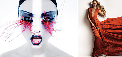
Conversely, we can use colorful backgrounds to highlight and isolate the subject and it’s this technique you’ll often see appearing in my own work. In the two images below, you’ll see me clearly using color to separate the foreground and background. On the left, a clear bold color is seen behind the model in stark contrast to her white dress and on the right I’ve colored a location in a bold blue to heavily contrast the red of the styling in the foreground. 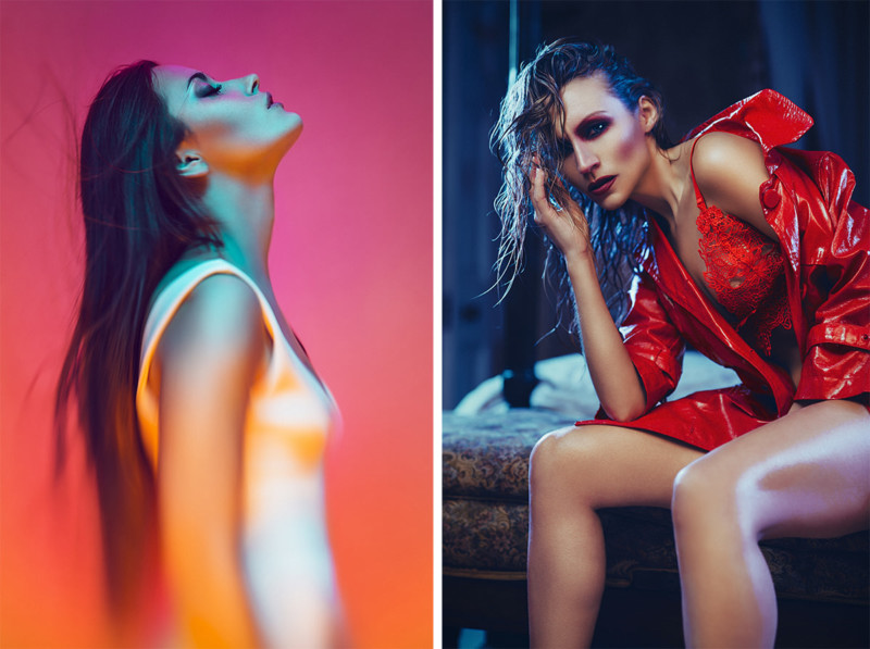
You can take this color separation theory one step further by sandwiching your subject between color as well. In my image below, you’ll see that I’ve artificially colored the background behind my subject, but I’ve also artificially colored the immediate foreground in similar colors as well. This technique of sandwiching the subject between color like this can be easily overdone, but if used in conjunction with a shallow depth of field, the viewer has no choice but to be engaged with the subject. 
#3. CompositesYou may be thinking that ‘composites’ is a relatively modern term, a word used to describe a puzzle of images rearranged to create an entirely separate piece. Surely this has only been truly possible with modern digital software? Well, as it turns out, composites is merely a modern word but the act of bringing multiple elements together to form a unique piece has been around almost as long as art itself. In our modern digital world, we often use composites as a way of bringing multiple images together for a number of reasons. Maybe we’re trying to create something that ultimately doesn’t exist in the real world, or maybe we’re simply trying to bring together varying exposures of a single scene that would ordinarily be near impossible to capture in a single frame. But whatever the reason for a composite, we are usually trying to create an impossible shot, a shot that simply doesn’t exist in reality. It should be no surprise then, that artists have been doing this for centuries and if it was good enough for them, it’s good enough for us. One of the core reasons for bringing multiple elements together in paintings was often due to larger paintings that had many, many subjects involved. Artists rarely got 10 important people to stand around and pose at the same time so they were often painted separately until the entire painting was complete, effectively creating an impossible shot. But multiple subjects wasn’t the only reason for composite painting like this. Below is a portrait of a man. The identity of the man is actually unclear and it may even be a self-portrait of the painter himself. This painting was made by Italian artist Paolo Veronese (Paolo Caliari) in 1576 and although it is assumed that this is what the subject looked like, the surroundings themselves are entirely made-up. 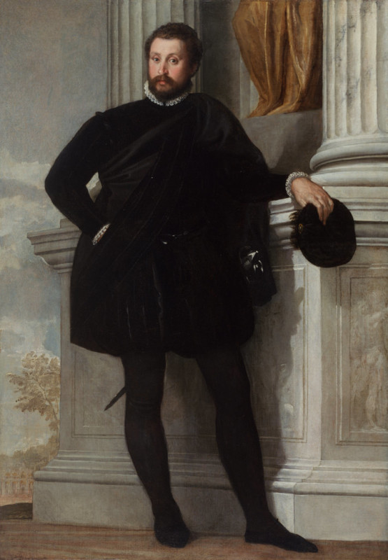
Back then it was very common to commission a portrait of yourself just as it still is today and back then, just like today, it was very common to have certain aspects of your portrait ‘enhanced’. In this instance it is believed that this painting was made in southern Italy and in that area, there were none of those trees we see present behind the subject. More importantly, though, the gentleman is confidently leaning against a plinth alongside vast, fluted greek columns. There were no such columns anywhere near this town in Italy, then or ever. This was a technique often used by artists as it gave them the ability to say something about the subject. In this instance, we see in the carved reliefs on those plinths beside him, scenes that give us hints to his profession, background or even military rank. As I said, this was a very common practice, but this image we see before us never really existed in reality. Another great example of composites from the Old Masters was in still life painting. The painting of still life subjects upon a table was incredibly popular, but it wasn’t until Jan van Huysum came along in the early 1700s and began creating impossible paintings that their popularity skyrocketed. Jan Van Huysum was nothing short of a genius with his brush and at his peak, he literally could not paint fast enough to keep up with the demand for his exquisite work. But what really stood Jan Van Huysum’s work apart, was his ability to capture fruit and flowers in unique arrangements. Up until that point, painters had painted what was in the fruit bowl or vase in front of them but in an era before the fridge, you were beholden to the seasons and what was in bloom at the time. Jan Van Huysum did away with that notion and brought together the best fruits and flowers from throughout the year into a single painting. 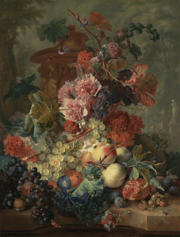
Jan Van Huysum image ‘Fruit Piece’ from 1722 simply never existed and it is an extraordinary collection of fruit and flowers that never sat in the same place at once. If you ever get the chance to see the work of Jan Van Huysum I urge to check it out as his skill is almost unbelievable. The detail in this piece is nothing short of breathtaking up close. In fact, his ability and technique were so highly coveted that he always worked alone and never allowed visitors to his studio. 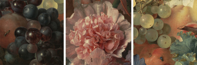
I’m sure you need little advice on where to look for inspiration for modern day composite photographers, and there are certainly many great composite artists out there to chose from right now. But here’s a few to get you started: Renee Robyn, Dave Hill, Erik Johansson. And remember, if compositing was good enough for the Old Masters hundreds of years ago, it’s certainly good enough for us today. #4. Composition and Leading LinesGranted this one should come as no surprise, but composition and lending lines have been a big part of the art world for a while now. But although you see this as obvious, strong composition is so often overlooked in modern photography in favor of simply recording what’s in front of you. I see too many current photographers get wrapped up in sharpness, megapixels and color balance to ensure they perfectly recreate what’s in front of their camera as accurately as possible. Unfortunately, none of these things will result in a ‘great’ photo, just like the perfect frame won’t make a great painting. As photographers, we need to be thinking about telling a visual story and to do that many great artists will use composition and leading lines to take our eyes on that visual journey around a frame. Simply plonking your model in the center of the frame isn’t going to cut it, and using a color checker, a $2,000 razor sharp lens, and a 100-megapixel camera will never change that. Let’s take a look at some Old Masters work and see what they did with composition and leading lines. 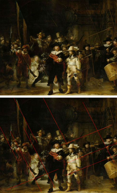
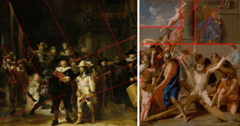
This painting of ‘The Night Watch’ by Rembrandt van Rijn in 1642 is likely one of the most studied paintings of all time, as art students across the globe discuss its art tropes and it could easily fill an entire article all by itself. But if we just briefly look at composition and leading lines alone, you’ll see how Rembrandt clearly uses shape, form, and objects to create leading lines that all lead us to the center subjects. This is one of those elements in artwork that may seem obvious once they’re shown to you, but to the unknowing viewer’s eye, this is an incredibly powerful visual tool. In the painting below, we see a slightly more complex use of leading lines. 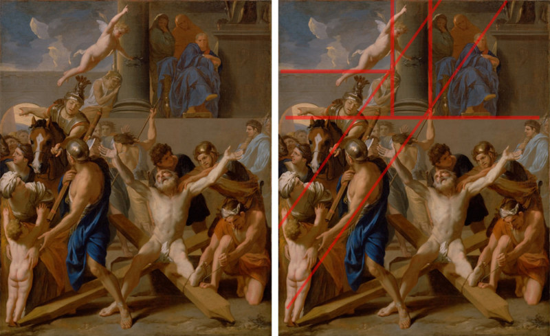
In the painting above, ‘The Martyrdom of Saint Andrew’ by Charles Le Brun we can clearly see very strong leading lines throughout this shot and if you continue to look at this image, more and more repeating shapes and symmetry begins to appear. Look again and see if the abundance of triangles starts to become more apparent. These very strong lines and balanced symmetry is incredibly hard to do in such a complicated piece and the more you look at this, the more compositional elements that start to emerge. There is of course nothing wrong with the modern images that are being produced today, but you may well struggle to find a modern image that comes close to this level of compositional complexity. As I previously mentioned, examples of striking composition and leading lines are harder to find today than you might think. Don’t get me wrong: of course it’s out there, but I think it plays less of a part in recent imagery than it has done historically. One of the most famous photographers for composition and leading lines is Henri Cartier-Bresson as his work in the 1930s is part of practically every self-respecting photo training bible out there. 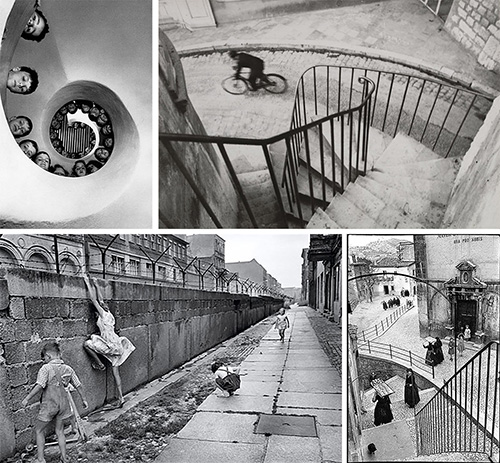
As we move further forward in time, it becomes harder to pick out striking forms of composition as so many other factors form a part of our modern photography repertoire. A great place to start though is the work of Mikael Jansson as his work will often contain many striking elements of composition. 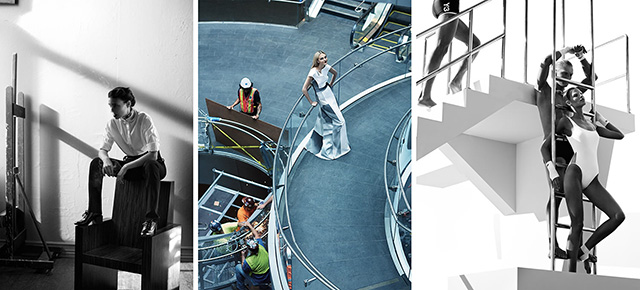
#5. ChiaroscuroLastly, we’ll take a look at one of my favorites: chiaroscuro. For those unsure of what that weird word means, chiaroscuro comes from the Renaissance period of art and is a word used to describe light and shadow. The Renaissance artists used dyed paper and then applied white gouache to create their works which resulted in a heavily contrasted image. This heavily contrasted artwork was seen again as woodcuts which resulted in only two tones being used; the ink on the woodcut and the surface it was to be printed onto. Chiaroscuro is only a word few artists would use today, but the more modern term for this heavily contrasted style of lighting, used in both cinema and still photography is ‘low-key lighting’. The key artists who later developed this chiaroscuro style was Leonardo da Vinci, Caravaggio, and Rembrandt and they were seen as the first individuals who stepped away from this HDR ‘look’ of everything being correctly exposed in paintings, and explored a stronger, almost single light style of work. Of course, back then the most prominent light source after the sun had gone down was candlelight, and it was this light source that was seemingly used in many of the chiaroscuro paintings. 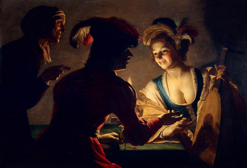
In the famous ‘Matchmaker’ painting by Gerard van Honthorst in 1625 we clearly see the candle in shot and as with so many great chiaroscuro paintings, the subjects are placed around the light source to create that stunning light to dark to light to dark tone throughout the frame. It’s pieces of art like this and it’s incredible use of the low-key lighting that should be seen far more in modern day black and white photography, but sadly this skill is being overlooked and often ignored. If you are even remotely interested in black and white photography, then please invest a little time in exploring these chiaroscuro paintings and their artists and guarantee you won’t be disappointed. Chiaroscuro was also a technique that started to get used a little more stylistically in single person portraits. In the image below ‘David with the Head of Goliath’ by Guido Cagnacci in 1645, we see a very clever use of chiaroscuro not only on the subject but on the background as well. 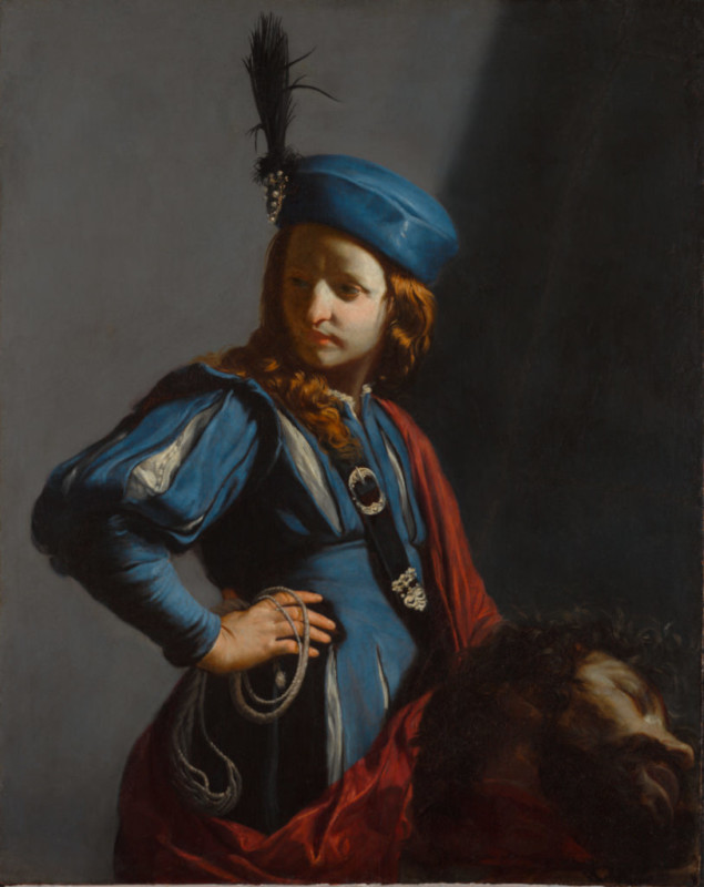
To me, this a staggeringly stylistic portrait at the time and the very clever use of light to shadow makes the image incredibly three dimensional. The diagonal shadow line behind the subject cuts through just as the light hits the face of David and then falls off to shadow again moments later before again returning to light behind him. It’s this beautiful play of light that is as elegant as it is simple. Once again, we rarely see this high-level execution of lighting in our modern image making and I feel it’s something many of us, myself included, could benefit from understanding more comprehensively. So what can we learn from chiaroscuro and begin to implement today? First and foremost, we once again need to isolate our subjects from our backgrounds and as artists that create two-dimensional images of three-dimensional objects, we need to introduce more visual depth into our portraits. I bring this up as I all too often see subjects disappearing into the backgrounds behind them and they end up getting visually lost in the frame. Take a look at the two examples below to see the difference in reference to ‘subject and background separation’. 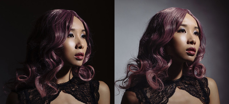
In the image on the left, you’ll see the model has no separation from the background and she appears to have no shape without that additional background light behind her. In the second image, you’ll clearly see the very strong separation that is now present that results in more shape and form in the subject as well as an added sense of depth to the shot. Both of these images were shot with a single light, the only thing that changed was how close the subject is to the backdrop behind her. As I moved her and the light closer to the background, the light fell onto her as well as the background and very quickly and easily we created the added depth to the shot with the addition of the light behind. Granted this is a very simplistic example of chiaroscuro being used in modern photography but the principles are the same. Create a sense of depth in your shot, not only on your subject but with the background as well. Closing ThoughtsThe bottom line is, the works of the ‘Old Masters’ are in galleries today and some of those paintings were painted hundreds of years ago, yet we still enjoy and contemplate them today. In a world where some images last mere seconds at most, it really is worth visiting what makes those art pieces so important to our visual culture today. Elements like a strong dynamic range, using color as a way to display depth, including impossible elements, strong composition, and engaging light and shadow were common staples in so many pieces art before. Now those incredibly powerful almost vital elements of an image, are far harder to find. I know I for one will be trying to include many of these elements into my future work and I would encourage you to do the same. After all, if it was good enough for the “Old Masters,” it’s good enough for us. About the author: Jake Hicks is an editorial and fashion photographer based in Reading, UK. He specializes in keeping the skill in the camera and not just on the screen. If you’d like to learn more about his incredibly popular gelled lighting and post-pro techniques, visit this link for more info. You can find more of his work and writing on his website, Facebook, 500px, Instagram, Twitter, and Flickr. This article was also published here. from https://petapixel.com/2018/11/29/5-things-photographers-can-learn-from-the-old-masters-of-painting/
0 Comments
Instagram is taking a step toward being more accessible by adding auto and manual descriptions of photos for visually impaired users. “We are introducing two new improvements to make it easier for people with visual impairments to use Instagram,” Instagram writes. “With more than 285 million people in the world who have visual impairments, we know there are many people who could benefit from a more accessible Instagram.” First, there’s a new AI system that will automatically generate descriptions of photos through screen readers when visually impaired users are browsing the Feed, Explore, and Profile sections of the app. The feature uses object recognition technology that studies each photo and comes up with a list of recognized items in the image. If you’d like more control over what the descriptions of your photos are, the Instagram all now lets you add custom alternative text as well. In Advanced Settings when posting a new photo, there’s a new option called Write Alt Text.
This lets you provide a richer description than what the AI is currently capable of creating.
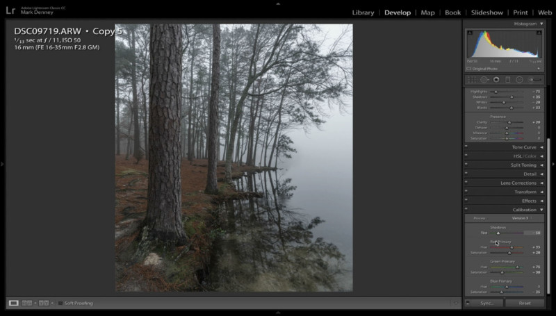
“These are just first steps toward creating a more accessible Instagram,” the Facebook-owned company says. from https://petapixel.com/2018/11/29/instagram-launches-ai-descriptions-of-photos-for-the-visually-impaired/ It seems the moody edit trend has been going strong for quite a few years now and it doesn’t appear to be slowing down. There’s probably not a better time of the year to capture moody landscape photos than the winter months. It’s interesting: if you search the web for ‘moody landscape photos’ you’ll instantly see a trend of cool, blue-and-green toned, subdued images — these characteristics appear to be the most common qualities of a good moody image.
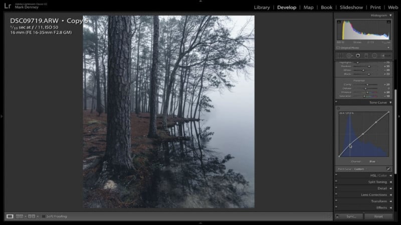
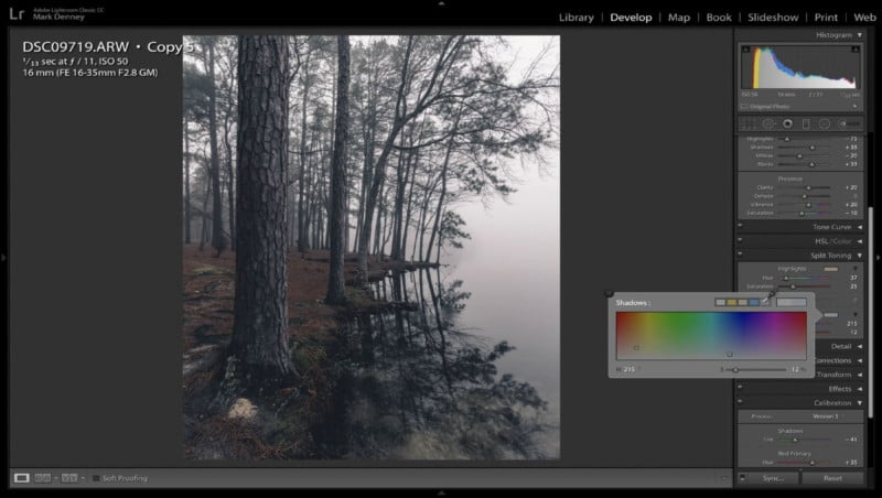
In the 10 minute video above, I review six Lightroom editing tips that I apply to my images to create or enhance the mood of a photo. 1. Reduce Exposure and Cool DownFirst, we want to reduce the exposure a bit and cool down the overall color temperature of the image. This step is an easy and straightforward one but it makes a dramatic impact on the feeling of the photo. 2. Tint the Shadows
This is something I don’t hear done very often, but tinting the shadows in the ‘Calibration” section and sliding the tint more towards the green side creates an impressive result that helps achieve that “cinematic” look. 3. Desaturate the Color PaletteThere are a few different approaches you can apply here to effectively desaturate an image. I generally like to increase vibrancy while at the same time reducing the saturation or I’ll jump into the HSL panel and individually change the saturation and luminance of each color channel. 4. Adjust Tone Curve
Subtle-Subtle-Subtle! You can get sideways real quick here if you’re not careful. Adjusting the Tone Curve of the blue channel can create an incredibly moody effect when done in an oh so delicate way. 5. Split the ToneI find that Split Toning is great for creating color contrast or color separation between the highlights and shadow areas of an image. Since we already applied a cool green tint to the shadows in Step 2, I want to apply a bit of warmth to the highlights to better separate the two regions of the photo. 6. Vignette & Texture
And for the finishing touch, I always like to apply a vignette to the image just to darken down the corners a bit to keep the viewer’s eye looking towards the center of the photo. And, apply a touch of grain just to rough the photo up a bit and get away from the perfectly clean digital image appearance. I’m sure there’s a slew of additional ways to apply a moody edit to an image, but these are the six steps I generally follow when creating this look. I’m always amazed at how simply adjusting the colors and color balance of an image can completely change the feeling of a photograph and it’s fun to do as well! P.S. If you enjoyed this video and article, you can find more by subscribing to my YouTube channel. About the author: Mark Denney is a landscape photographer based in North Carolina. The opinions expressed in this article are solely those of the author. You can find more of his work on his website, Facebook, Twitter, and Instagram. from https://petapixel.com/2018/11/29/6-lightroom-tips-to-create-moody-landscape-photos/
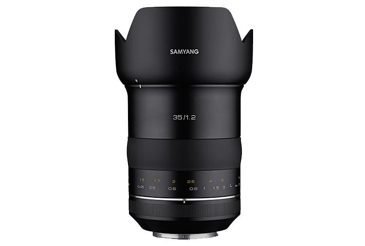
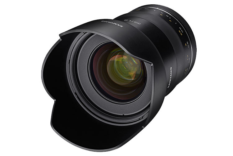
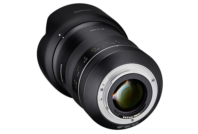
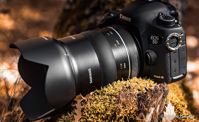
Samyang has announced the new XP 35mm f/1.2 lens for Canon EF cameras. Also called the Rokinon SP 35mm f/1.2, the new premium-quality manual-focus lens is designed to meet the needs of professional shooters.
The new 35mm is the fourth premium manual focus lens created by Samyang, joining the XP 14mm f/2.4, XP 50mm f/1.2, and XP 85mm f/1.2.
Samyang says the image quality of the lens is suitable for high-resolution imaging, including 50-megapixel still photos and 8K video productions.
“It is a perfect lens choice for capturing a broad range of subjects in vivid colors and exceptional high-resolution images such as nightscapes, portraits, architecture, and anything in difficult lighting conditions,” Samyang says.
Features and specs of the XP 35mm f/1.2 include 12 elements in 10 groups, an aluminum alloy build, a 9-blade aperture, beautiful bokeh, starburst effects, damped and precise manual focus control, EXIF data registration, and a non-rotating filter mount.
Here are official sample photos captured using the lens:
The new Samyang XP 35mm f/1.2 will be available from dealers around the world starting in January 2019 with a price tag of $999. from https://petapixel.com/2018/11/29/samyang-unveils-the-xp-35mm-f-1-2-lens-for-canon-ef/
I've made a conscious effort in the past few years to move away from Adobe Lightroom Classic CC in every way possible; and with today's release of Capture One 12 I can say with certainty that it does most of what Lightroom does even better. There is a big emphasis on most--but the truth is that for most photographers, Capture One 12 will do everything better than Lightroom does. In that previous sentence there is a HUGE emphasis on everything. With today's announcement integrating into Capture One 12 the addition of plugins, a variety of masks, and the long awaited Fujifilm Film Simulation additions, there are lots of major reasons why Capture One 12 is the best one yet.
from https://www.thephoblographer.com/2018/11/29/review-capture-one-12-most-of-the-enhancements-we-really-needed-and-wanted/
Earlier today, Phase One announced the release of Capture One 12, a major version update to the company's RAW conversion, image editing, and asset management software. With the release of version 12, Capture One's user interface has been completely overhauled while maintaining the program's high degree of customizability, including a brand new menu system as well as a keyboard shortcut manager. Additionally, Capture One 12 also introduces three new masking tools for added creative possibilities when processing RAW files: Luma Range (Luminosity) Masking, Linear Gradient Masking, and Radial Gradient Masking. Another enhancement introduced with Capture One 12 is a new Capture One Plugins ecosystem, allowing third party developers to expand the functionalities of Capture One. Fujifilm support was first introduced with Capture One 11.3, and with Capture One 12, Fujifilm support is further enhanced with the introduction of Fujifilm Film Simulations support.
from https://www.thephoblographer.com/2018/11/29/the-new-capture-one-12-introduces-ui-enhancements-plugins-and-more/
When Nikon first announced that they were finally entering the Full Frame Interchangeable Lens Mirrorless camera market with the Z6 and Z7 back in August of this year, only the 45.7MP Z7 was initially available. From a business standpoint, it certainly made sense that Nikon would want to release the top end Z7 first as demand for the brand new camera system would surely skyrocket, especially since Nikon was playing catchup when it comes to Mirrorless. Fast forward to today, three months after initial announcement, the Z6 is finally available. With a more modest resolution of 24.5MP and a lower autofocus point count of 273, but boasting faster frame rates (12 FPS in the Z6 vs 9 FPS in the Z7) and double the ISO sensitivity (a maximum of 51,200, expandable to 204,800 in the Z6 vs a maximum of 25,600, expandable to 102,400 in the Z7), pricing for the Nikon Z6 is also much more reasonable, coming in at only US $1995.95 compared to the Z7's US $3,399.95. Nikon recently invited us down to Florida to test out the brand new Nikon Z6 in a variety of different conditions, and our experiences so far have been fairly positive. Despite having a lower resolution and autofocus points, the Z6 may actually be the Mirrorless camera that will suit the needs of more photographers when compared to the Z7, especially if you've already got a good selection of F mount lenses and are looking to stay with Nikon while moving into the Mirrorless world.
from https://www.thephoblographer.com/2018/11/29/first-impressions-nikon-z6-a-more-affordable-lower-resolution-z7/
DJI has announced the new Osmo Pocket, the world’s smallest 3-axis stabilized camera designed for the masses. It’s small enough to fit in your pocket while still shooting high-quality photos and videos. Despite measuring roughly 4 inches tall, the Osmo Pocket contains a 1/2.3-inch sensor that captures 12-megapixel photos and 4K videos at up to 60fps and 100Mbps. The state-of-the-art three-axis mechanical gimbal on the camera helps you capture sharp photos and smooth videos by compensating for shake and movement. On the back of the Osmo Pocket is a 1-inch touchscreen that provides live view and the interface for adjusting things like shooting modes, settings, and reviewing captured imagery.
Under the Osmo Pocket is a universal port that allows the camera to be paired with mobile devices that use Apple’s Lightning or USB-C connections. Paired devices can be used as a monitor for the camera.
Other features include dual microphones, advanced noise-canceling, up to two hours of battery life while shooting 4K/30fps, ActiveTrack subject tracking, FaceTrack face tracking, Timelapse, Motionlapse, FPV Mode (capturing your view instead of a level horizon), 3×3 panoramas with 9 photos, and 180° panoramas. There’s also an ecosystem of accessories, including an accessory mount, wireless module, controller wheel, expansion kit, filters set, waterproof case, extension rode, charging case, and 3.5mm adapter.
“Innovation is at the heart of every product we create and DJI Osmo Pocket is here to change the way photos and videos are captured, not just by professionals but by parents, couples, adventurers, travelers, and everyone in between,” says DJI President Roger Luo. “Osmo Pocket is a portable personal camera crew and we can’t wait to see how people use it to capture their stories and share them with the world.” One immediately obvious use for this tiny high-res camera would be vlogging, an industry that’s exploding in popularity.
Here’s a 3-minute video that introduces the Osmo Pocket: Here’s a 6.5-minute hands-on review of the camera by B&H: The DJI Osmo Pocket will start shipping on December 15th, 2018, and it has a price tag of $349. from https://petapixel.com/2018/11/28/dji-osmo-pocket-the-worlds-smallest-3-axis-stabilized-4k-camera/
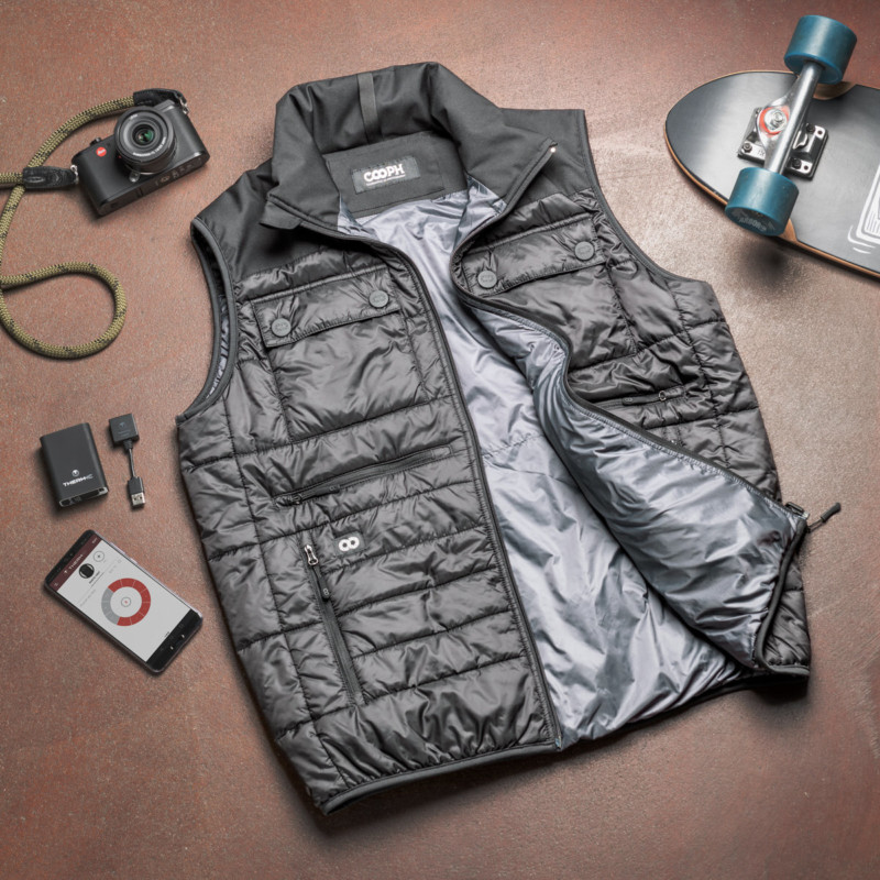
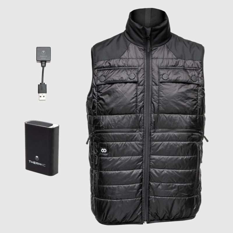
The photography apparel and accessory company COOPH has announced a new photo vest for feature- and fashion-conscious photographers. It’s a high-tech reinvention of the classic photo vest that has built-in heating.
The traditional photo vest “is an iconic garment unchanged for 80 years, but what they offer in functionality they’ve always lacked in style,” COOPH says. “In the fast-moving world of photography, we wanted to create something for the needs of the modern photographer. Something with useful and innovative features that looks as good on the streets as it does at a photo shoot.” The Heatable Photo Vest is what the company came up with.
Made in Poland, the reversible vest is ultra-lightweight and can fold up compactly when not being worn.
Put it on, and sheep wool insulation keeps you warm. If you need some active heating, the built-in THERM-IC heating system can warm your hand pockets as well as the kidney, back, and stomach areas of the vest — the companion COOPH 5200mAh battery provides 5 hours of heating, but the vest is compatible with any rechargeable 5V power bank that uses a USB connection.
To control the heat, you can also pair a smartphone to the vest using the THERM-IC Bluetooth dongle and the free THERM-IC app for iOS and Android. In addition to controlling the temperature, the smartphone app can also automatically adjust the temperature as you move around.
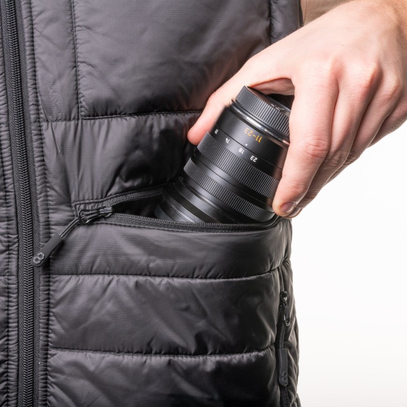
As a good photo vest should, the COOPH Heatable Photo Vest provides a number of pockets and storage options for carrying your camera gear, accessories, and other small items.
The reversible vest has a different styling on the reverse side.
Here’s a 2.5-minute video in which COOPH introduces the Heatable Photo Vest and its features: The COOPH Heatable Photo Vest is now available in black or navy with a hefty price tag of €389, or about $440, for the complete package. You can also purchase the vest by itself for €299 ($340) without the €39 ($44) power bank and €69 ($78) Bluetooth dongle. from https://petapixel.com/2018/11/28/coophs-new-photo-vest-has-built-in-heating/ There are action shots in movies, and then there’s this video that will give you sweaty palms. A camera mounted on a hang glider captured what happened when a man suddenly realized that his safety harness wasn’t attached to the glider. It was a 2-minute-long white-knuckle ride 4,000 feet in the air. American Chris Gursky was visiting Switzerland when he decided to experience hang gliding for the first time. Before launching from a high hilltop, however, the instructor in the tandem flight failed to attach Gursky’s safety harness to the glider. Only after launching into the air did the duo suddenly realize that Gursky was completely untethered and hanging on with only his hands. And despite the instructors best efforts, the glider had no place to land for over 2 minutes, during which it flew higher and higher until reaching a reported 4,000+ feet. Gursky gripped the steering bar as hard as he could with his left hand while searching about with his right hand in an effort to find a good grip on the instructor’s body and harness. He held on just long enough for the instructor to get low enough for a bumpy end to the terrifying flight. “The landing was a rough one, but I lived to tell the story,” Gursky says. He fractured his wrist in his fall to the ground, but he otherwise escaped serious harm and death. And he left Switzerland with one heck of a vacation video… (via Gursk3 via Steve’s Digicams) from https://petapixel.com/2018/11/28/this-video-shows-an-untethered-hang-glider-hanging-on-for-dear-life/ |

Paul DeckerHi I Paul Decker,32 years old from Arizona,AZ,USA,working on 3D animation from the last 4 years.Here I am sharing tips about it. Archives
April 2019
Categories |


 RSS Feed
